After enjoying the DDB's Fall Market keynote presentations by Michael Boodro of Elle Decor and Wendy Goodman of New York Magazine, don't miss the chance to meet a style, and industry, icon. On Thursday, October 11, Stark Carpet will host "Accidental Icon: A Discussion with Iris Apfel", founder of Old World Weavers, and Huffington Post Style Senior Editor Brie Dyas.
Iris Apfel’s penchant for mixing influences from all over the world into her own, personal aesthetic is legendary. Apfel’s work is imbued with a look that is unmistakably hers. Dyas will interview her about everything from her eclectic approach to design to the story behind Old World Weavers, the legendary fabric house Apfel co-founded with her husband Carl Apfel and that was acquired by Stark in 1993. Apfel is a one-of-a-kind storyteller. A cocktail reception will be held after the discussion. Event is invitation only. In anticipation, we're revisiting a great discussion with Apfel from earlier this Spring at Sotheby's.

Showing posts with label Stark. Show all posts
Showing posts with label Stark. Show all posts
Wednesday, September 26, 2012

Friday, September 14, 2012
Travel to Tangiers with Stark Paint
Yesterday we shared some pictures from color superstar David Oliver's recent visit to Tangiers along with colors from his Stark Paint line. Ready to continue the journey? We thought so!
This white portico and blue doors:
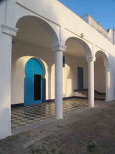
...is Blue's Blue:

This derelict salon:
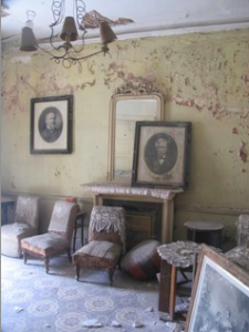
...is Both Barrels:
This Cane Beach shack with Moroccan flag:
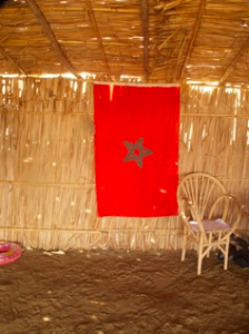
...is Straw V:

These Moroccan textiles:
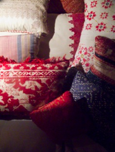
...are Trilogy and Very Well Read:


This yellow arch:
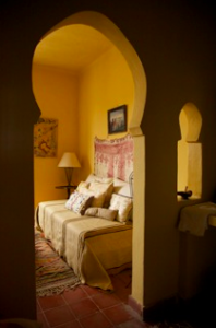
...is Split Straw:

This painting of Moroccan musicians playing:
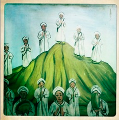
...is Moss:
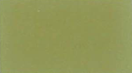
See the entire range at Stark at the DDB, PDC, DCOTA and DCH. And with that, we say bon voyage for the weekend, wherever it may take you!
This white portico and blue doors:
...is Blue's Blue:
This derelict salon:
...is Both Barrels:
This Cane Beach shack with Moroccan flag:
...is Straw V:
These Moroccan textiles:
...are Trilogy and Very Well Read:
This yellow arch:
...is Split Straw:
This painting of Moroccan musicians playing:
...is Moss:
See the entire range at Stark at the DDB, PDC, DCOTA and DCH. And with that, we say bon voyage for the weekend, wherever it may take you!
Thursday, September 13, 2012
David Oliver shares colors from Tangiers
We asked David Oliver, color expert and creator of the UK Paint Library and the Stark Paint line. Oliver loves to spend his vacations in Tangiers, Morocco. We asked him to share his snapshots from his summer visit, and tell us which colors in the Stark Paint line are inspired by the palette.
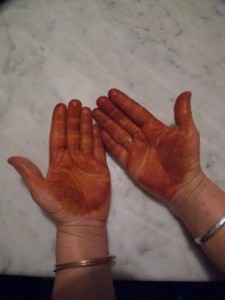
...is Beetlenut:

The Kasbah gate:
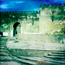
....is Snettisham Gold:
This Islamic Pavillion tiled porch:
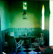
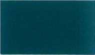
...is Teal:
These tiles, pillow and vase:
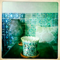
...is Deep Water Green:

Check back tomorrow when we'll finish the trip to Tangiers! Stop by Stark at the DDB, PDC, DCH and DCOTA to choose the colors that capture your own special place.
...is Beetlenut:
The Kasbah gate:
....is Snettisham Gold:
This Islamic Pavillion tiled porch:
...is Teal:
These tiles, pillow and vase:
...is Deep Water Green:
Check back tomorrow when we'll finish the trip to Tangiers! Stop by Stark at the DDB, PDC, DCH and DCOTA to choose the colors that capture your own special place.
Friday, August 10, 2012
Mad for Margo (Selby)!
We've been a fan of Margo Selby practically since she launched her line in 2003. What started as a line of textiles in a variety of distinctive dots patterns has turned into a collections of wallpapers, scarves, pillows and rugs. Here's a look at some of her latest designs, terrific as drapery or made into pillows -- we've even seen it used as a beautiful headboard.
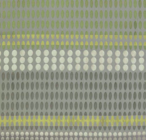
Depending on the colorway, the dots can be as subtle or pronounced as you fancy.
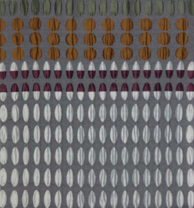
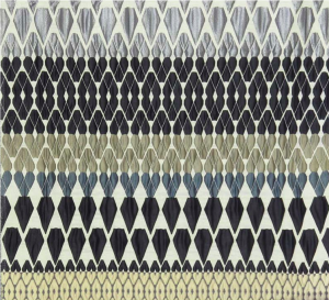
Aren't they captivating?
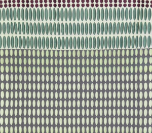
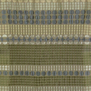

We think they can range from looking mod to ethnic, or even remind us of traditional East Asian textiles.
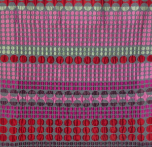
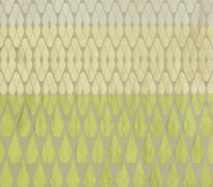
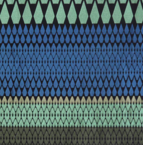
Selby's textiles are available at Stark at the DDB and DCH and be mesmerized by the choices.
Depending on the colorway, the dots can be as subtle or pronounced as you fancy.
Aren't they captivating?
We think they can range from looking mod to ethnic, or even remind us of traditional East Asian textiles.
Selby's textiles are available at Stark at the DDB and DCH and be mesmerized by the choices.
Wednesday, May 23, 2012
As seen in: Luxe Magazine
Pick up a copy of Luxe's Spring issue for a look at some of the editor's favorite finds at the DDB. A graphic paper by Farrow & Ball is pictured above.
Howard Slatkin's runner for Stark is pictured on this staircase:
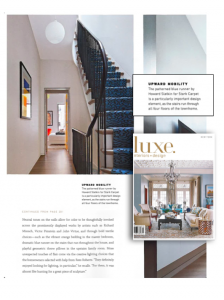
Kevin Reilly's decorative accessories at Holly Hunt:

And Kravet's upholstered bed:
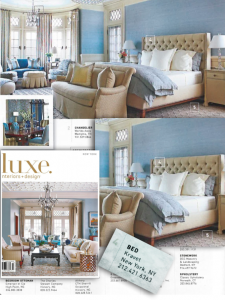
Howard Slatkin's runner for Stark is pictured on this staircase:
Kevin Reilly's decorative accessories at Holly Hunt:
And Kravet's upholstered bed:
Anya Larkin discusses her wallpapers, inspiration
During DDB's Spring Market last week, Stark hosted a presentation by Anya Larkin, who spoke about the inspiration of her wallcoverings and the creative process. Larkin worked in film and fashion, including a decade with Mary McFadden. "I really loved being a part of the making process," she says. "While working with Mary I developed a line of textiles, when a client asked me to do wall coverings. I searched the DDB and I didn't find anything that I would want in my own home. It all felt too commercial. So I went to the art stores, and I played around with rice paper and different textures, and then I learned how to back it." Her line of wallcoverings, all handmade by her team of artisans, is represented at Stark. Here's a recap of what she shared with the audience of bloggers and designers.
"I always go to the Metropolitan Museum of Art for design inspiration. Just to be in the temple of art and to feel the great artists and be inspired. I look at ceramic glazes, Japanese armor. Not to copy but to plant the seed of inspiration. My prints are all classically derived. A fleur de lis has been drawn thousands of times, so why do I need to try to reinvent it? I'll change the color, scale, but always start from a classical point. A non-print starts with an inspiration from a glaze, for its colors or textures. I contemporize something that was centuries old and I try to make it refreshed. I never learned how to make a repeat in art school, so I hand draw it all, which might be crazy, but it makes for patterns that reveal subtle differences.
This design [pictured below] was inspired by an origami box we did for a client gift, which when I disassembled it, was so beautiful.
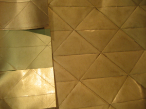
We have a factory in Long Island City, we just moved from 28th Street. Quality and craftsmanship are critical to me: I hire textile people, who are used to doing the same thing over and over again. Artists want to do everything different each time. Everyone with me has assisted for at least a year before doing any sort of production. We examine everything personally before it goes out. I don't want my name attached to anything that isn't done right.
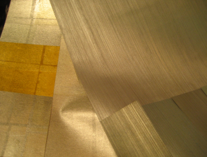
On Color: In the 70s and 80s I was with Mary McFadden when she was doing brights. I had to work to refine my palette, but at first I couldn't seen the subtleties. I looked at white for a while. I'm interested in colors that flip between two colors--greens-blues-greys. I use full spectrum colors (yellow, red, green) to make my beiges. Once we spent two weeks making a beige. I don't like clear bright colors. We have big windows with north light. Sometimes in the winter we go out onto the street to look at colors. Size and scale is incredibly important. The negative space is as important as the positive space. Many different techniques are involved, many with multiple techniques per final product."
"I always go to the Metropolitan Museum of Art for design inspiration. Just to be in the temple of art and to feel the great artists and be inspired. I look at ceramic glazes, Japanese armor. Not to copy but to plant the seed of inspiration. My prints are all classically derived. A fleur de lis has been drawn thousands of times, so why do I need to try to reinvent it? I'll change the color, scale, but always start from a classical point. A non-print starts with an inspiration from a glaze, for its colors or textures. I contemporize something that was centuries old and I try to make it refreshed. I never learned how to make a repeat in art school, so I hand draw it all, which might be crazy, but it makes for patterns that reveal subtle differences.
This design [pictured below] was inspired by an origami box we did for a client gift, which when I disassembled it, was so beautiful.
We have a factory in Long Island City, we just moved from 28th Street. Quality and craftsmanship are critical to me: I hire textile people, who are used to doing the same thing over and over again. Artists want to do everything different each time. Everyone with me has assisted for at least a year before doing any sort of production. We examine everything personally before it goes out. I don't want my name attached to anything that isn't done right.
On Color: In the 70s and 80s I was with Mary McFadden when she was doing brights. I had to work to refine my palette, but at first I couldn't seen the subtleties. I looked at white for a while. I'm interested in colors that flip between two colors--greens-blues-greys. I use full spectrum colors (yellow, red, green) to make my beiges. Once we spent two weeks making a beige. I don't like clear bright colors. We have big windows with north light. Sometimes in the winter we go out onto the street to look at colors. Size and scale is incredibly important. The negative space is as important as the positive space. Many different techniques are involved, many with multiple techniques per final product."
Tuesday, May 31, 2011
DDB Spring Market Buzz: Stark Showcases Scenic Murals
The Stark showroom buzzed all day with Spring Market events at the DDB. We particularly loved the Scenic Murals presentation on the elements of 'couture' and modern product with historic origins.
Jay Hupp, Director of Scenic Murals, presented highlights from Stark's new hand painted Chinese and European scenic collections and discussed the origins of the historic designs that inspired them. The sources of inspiration ranged from European homes to several collections at the Winterthur Museum in Delaware.
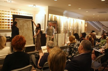
"We are so very proud to offer our clients such a wide variety of product lines at Stark," said Sylvana Carlucci, Creative Director for Stark Wallcovering and Paint. "Our hand-painted scenic murals are truly a personal masterpiece. We're thrilled for each client who has chosen these murals to enjoy in their surroundings and personal spaces for many years to come."
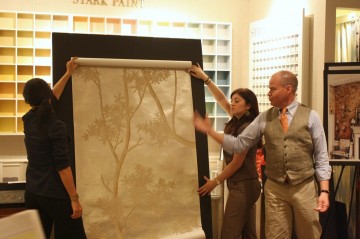
"Jay has worked with these unique products for over 13 years," said a Stark sales associate. "Each order often becomes a truly handmade or 'couture' addition to a client’s interior and home, so we're very proud to be presenting this with Jay during Spring Market."
Check back with GoDesignGo this week for more DDB Spring Market Buzz.
Monday, May 23, 2011
Event Spotlight: Stark Celebrates Thibaut's Artisan Collection
Thibaut's new Artisan Collection has just launched and Stark is celebrating with the event, Translations of Original Art to Final Product, co-hosted by Ken Wampler of Alpha Workshops.
View Thibaut's new collection now on display and learn how original designs can be translated into wallcoverings and decorative art. A luncheon will follow at the Stark showroom.
The event takes place this Wednesday, May 25 at 11:00 a.m. at the DDB's Stark showroom in Suite 1002. For more information, visit http://www.ddbuilding.com/.
Wednesday, December 15, 2010
Charlotte Moss’ Unexpected Muse
If you checked out Stark's newly-installed window display in the DDB's lobby, you are in for a treat. Designed by Charlotte Moss herself, the exotic and colorful tent-like structure shows off the designer’s newly introduced Passport Collection, inspired by her travels in Istanbul.
“My muse, which is traveling, is like a siren. It's always tugging at the ankle," Charlotte explained. "A tent is an image that evokes journey, voyage, exploration and discoveries. It evokes new worlds, people and things.”
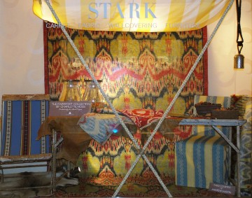
It’s no surprise that Charlotte’s design philosophy is to live passionately, decorate luxuriously, entertain beautifully—and always maintain a sense of humor through it all.
The Passport Collection is available at Stark in the DDB, PDC, DCH or at the Brunschwig & Fils in the DCOTA.
Thursday, November 4, 2010
Charlotte Moss' ‘The Passport Collection’ now at Stark
For their second collaboration, Stark and Charlotte Moss have created an exotic wool-based line of rugs. Charlotte’s designs for woven sisals were introduced earlier this year.
The designs incorporate a fresh take on the classic ikat fabrics palette with cool shades of aqua, citrus, raspberry, and tonal graduations in blues and beiges. We like to think of it as bringing a delicious piece of history into the modern home.
Charlotte designed these hand-knotted carpets after a vacation in Istanbul where she was inspired by the beautiful patterns and colors of vintage ikat silks from Uzbekistan and other distant lands.
“Charlotte has successfully captured the native cultures of two continents with the exotic patterns in her new collection of ikat designs that were created especially for Stark,” says John Stark, Chairman of Stark. “The balance of color and classical motifs further exemplify her unlimited design talents.”
In addition to designing carpets for Stark, Charlotte Moss has created fragrances for Agraria, china for Pickard, decorative accessories and jewelry for Halcyon Days and fabrics for Fabricut (Fall 2011). Charlotte’s seventh book, Charlotte Moss Decorates, will be released in April by Rizzoli International.
For more information, please contact Amy Slimak Whittle at (212) 752.9000
Tuesday, September 7, 2010
Anna French New at Stark
The Stark showroom in the New York D&D Building has expanded its Thibaut offerings to include Anna French brand wallpapers and fabrics. Anna French, a London-based division of Thibaut, showcases dramatic design and use of color. The new Wild Flora collection is a gorgeous vintage floral collection with designs created as individual expressions of art. It pushes the boundaries of document designs with printing techniques on foils and textured non-woven papers. Traditional designs are given a modern twist with mirrored flowers, white on white prints, and metallic effects. Songbirds, an elegant floral design, is printed in grey and white over a foil background, resembling a tarnished Venetian palace mirror. The design also comes in white-on-white, with a pencil-rendered effect. Another dramatic combination includes gold and green over a textural non-woven plum paper.
Photo: Velvet Jacquard showcases the dramatic designwork and color found in Anna French's new Wild Flora collection.
Photo: Velvet Jacquard showcases the dramatic designwork and color found in Anna French's new Wild Flora collection.
Tuesday, August 24, 2010
Stark Dips Into a New Medium
Subscribe to:
Posts (Atom)