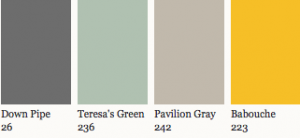
An American expat now based in Germany, Holly Becker (pictured below), an author, stylist and the editor of Decor8 said, "A very English scheme to me is Down Pipe, Teresa's Green, Pavilion Gray, Off Black and a touch of Babouche. This scheme would work really well in an office as the warm, energetic Babouche would add personality and the black would bring in a graphic element and a more professional tone. I'd love to see this scheme in a boy's room or in an industrial kitchen too."

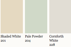
Architectural designer Ben Pentreath (pictured below) chose this palette for his own home in West Dorset, "to perfectly reflect the greens of the valley where the house sits, in brilliant sunshine, on a south-facing slope."
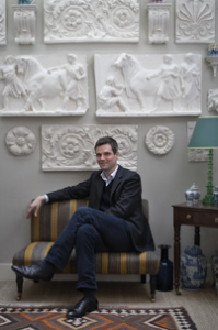
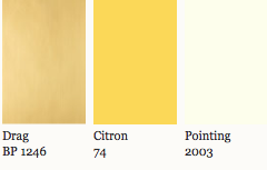
John Lyle, an American designer (pictured below) whose designs are carried at Holly Hunt at the DDB and David Sutherland at the PDC and DCH, said he would "channel more David Hicks than Nancy Lancaster, although her yellow influence cannot be overlooked. I would cover the walls in a sunny yellow strié paper from Farrow & Ball such as The Dragged Papers, DR1246 and paint the ceilings in Citron with trim in a crisp colour from Farrow & Ball such as Pointing. For the furniture, curtains and rug I would choose all snappy black and white- sharp and graphic -Hicks-esque patterns and solids to balance to the strong yellow. One could not help but be happy in this room."

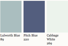
For Gerd Sommerlade, another German stylist and designer (pictured below), "Lulworth Blue, Pitch Blue and Cabbage White are beautiful colors. These nuances of blue combined with white remind me of the famous bicoloured ceramics from Josiah Wedgwood of the 18th-century. These dishes ennoble each table in the same way that a soft paint makes a dining room much more beautiful."

Stop by and choose your own favorites at the DDB (Suite 1519). And check back tomorrow morning and we'll share more favorite F&B color schemes.

[...] More designers create a British palette with Farrow & Ball August 3rd, 2012 Yesterday we brought you four color schemes from different international designers, thanks to Farrow & Ball's [...]
ReplyDelete