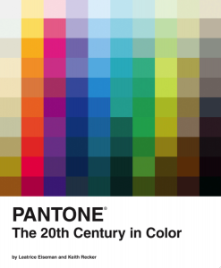
Keith Recker presented excerpts from his newly acclaimed monograph with an overview of the colors of 20th Century design. The informative, funny talk featured slides Recker pulled from his book, with a decade by decade exploration of color trends in fashion, interior and culture.
Here are some notable examples:
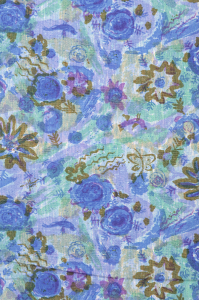
1950s: Classic American red, which was epitomized by Elizabeth Taylor, Marilyn Monroe and their iconic red lips. Here's an example of an interior, photographed by Horst P. Horst, which encouraged the use of cottons in interiors. The contrast to this was a love of pastels, which Recker tied to the technical revolution in color film, taking the medium from technicolor to a more subtle, fragile glamour, with examples of Audrey Hepburn and Grace Kelly. His suggestion: "Go to YouTube and type in Pretty in Pink and Funny Face for all of the color advice you need." Larsen's 1954 Spice Garden fabric captures the pastel influence:
1960s: "Jackie Kennedy's 1962 state visit to India brought color consciousness to our American eyes."
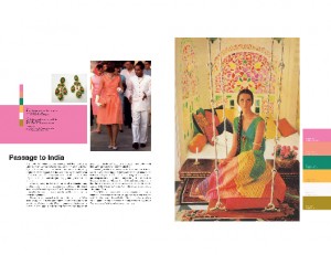
You can see the color inspiration in Larsen's Tapestry design (pictured below).
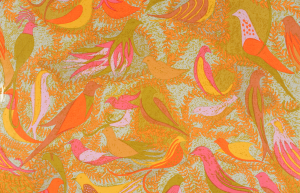
Likewise, Sheila Hick's Kerala captures the love of the pink and green combination. "Warhol was another influence, with his juxtapositions of blood red with softer lavenders."
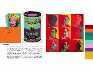
And Larsen's Mid Summer velvet and the Landis upholstery seen on Braniff Airways seats shows how pervasive that palette was.
1970s: "Avocado green and burnt gold was everyone's favorite, spurred by the environmental movement and passage of Clean Water and Air acts in 1970. Open plan houses reflected our interest in the exterior world." Here's an example of a Larsen printed velvet from 1970.
"Simultaneous to this was an obsession with French Country (it was around the time that Pierre Deux was born), and it wound its way into the sensibility of Laura Ashley and Terence Conran's Habitat store.
1980s: Preppy! "Princess Diana epitomized this look, with countless outfits of hunter green and crimson. In the home world, look at Hutton Wilkinson's pavilion or Mario Buatta's chintz. There was also a love of mauve, the follow up to avocado. It was grounded and earthy, and seems to have come to the national attention with the traveling Georgia O'Keeffe retrospective which brought her Santa Fe colors around the country."
1990s: "Celadon followed mauve as the a la mode color. Martha Stewart's zen, restrained palette and aesthetic was juxtaposed with the growing popularity of gold and bling, as seen with Michael Jackson and Gianni Versace."
It was a fascinating look at how color trends might not be random after all. Ultimately it's hard to notice when you're in the moment (but we all know right now it's neon!) so pick up the book to delve deeper.

No comments:
Post a Comment